1

Usually, when I see mobile webpage issues, I chalk it up to the site's developer not making the page universally mobile-friendly. Sometimes it's videos that extend beyond the bounds of the screen and I'm unable to zoom out, sometimes it's text.

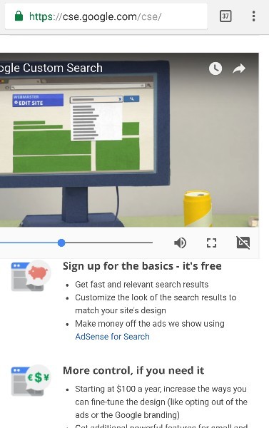
However, I came across this page which is Google's own page. Why is it that on Google's Nexus 6P (with Google's Android) using Google's Chrome browser, the page ends up looking like this: 

enter image description here

I can't even watch that video correcty, let alone pause it, without blowing it up to full screen.

If Google can't even keep issues like this from cropping up, part of be thinks it must be pretty difficult from a development standpoint. I don't know if there is any user-end methods to avoid this, so I guess my question is: Is there some way I can force Chrome to always display objects like this in a usable fashion?

Note: I have force zoom enabled, but unfortunately that only guarantees the ability to zoom in and doesn't allow the option to zoom out far enough to enclose all content on the pages I'm referencing.

1 Answer 1

3

It isn’t browser’s fault, the video container has hardcoded width of 560px, that’s about 1960px on Nexus’s screen, which itself has width of 1440px. That’s webmaster’s fault, as it’s possible to make the container smaller on smaller screen.

As the browser simply does its job, there aren’t many solutions, but here’s what I can suggest:

  • rotate the screen (in landscape mode you have 2560px, that should be enough);
  • set “Request desktop site” in Chrome’s menu. Again, the website won’t be much more usable in portrait mode, but you’ll be able to see the whole video;
  • watch it fullscreen.
3
  • That's about what I expected. I had hoped there might be some way to force scaling somehow, but I didn't really expect it to be likely on the Android version of Chrome. Maybe an add-on on desktop, but since Chrome on Android doesn't have add-ons, I didn't think it was too likely. Commented Feb 27, 2017 at 3:16
  • Does the same for text that that hangs off the edge but doesn't allow me to scroll left or right to see it? I usually can turn my screen for these, too, but it's still frustrating. Commented Feb 27, 2017 at 3:17
  • @SendersReagent, are you referring to a specific website? Anyway, such situation would be possible if a too wide HTML node was contained inside another node that’s width was the same as screen width (or smaller) and if the latter didn’t allow overflowing content to be visible. Unfortunately, it’s common if a page wasn’t designed with mobile in mind.
    – gsc
    Commented Feb 27, 2017 at 10:29

You must log in to answer this question.

Not the answer you're looking for? Browse other questions tagged .